The heading is an important element in the design of an electronic menu. It creates an atmosphere and conveys artistic taste. To achieve the best results, it is important to understand the creative and the technical parts, what methods are used in modern design, and what nuances you need to pay attention to.
To achieve the best results, it is worth understanding not only the creative but also the technical part, what approaches are used in modern design, and what nuances you need to pay attention to.
Mobile First and Responsive Design
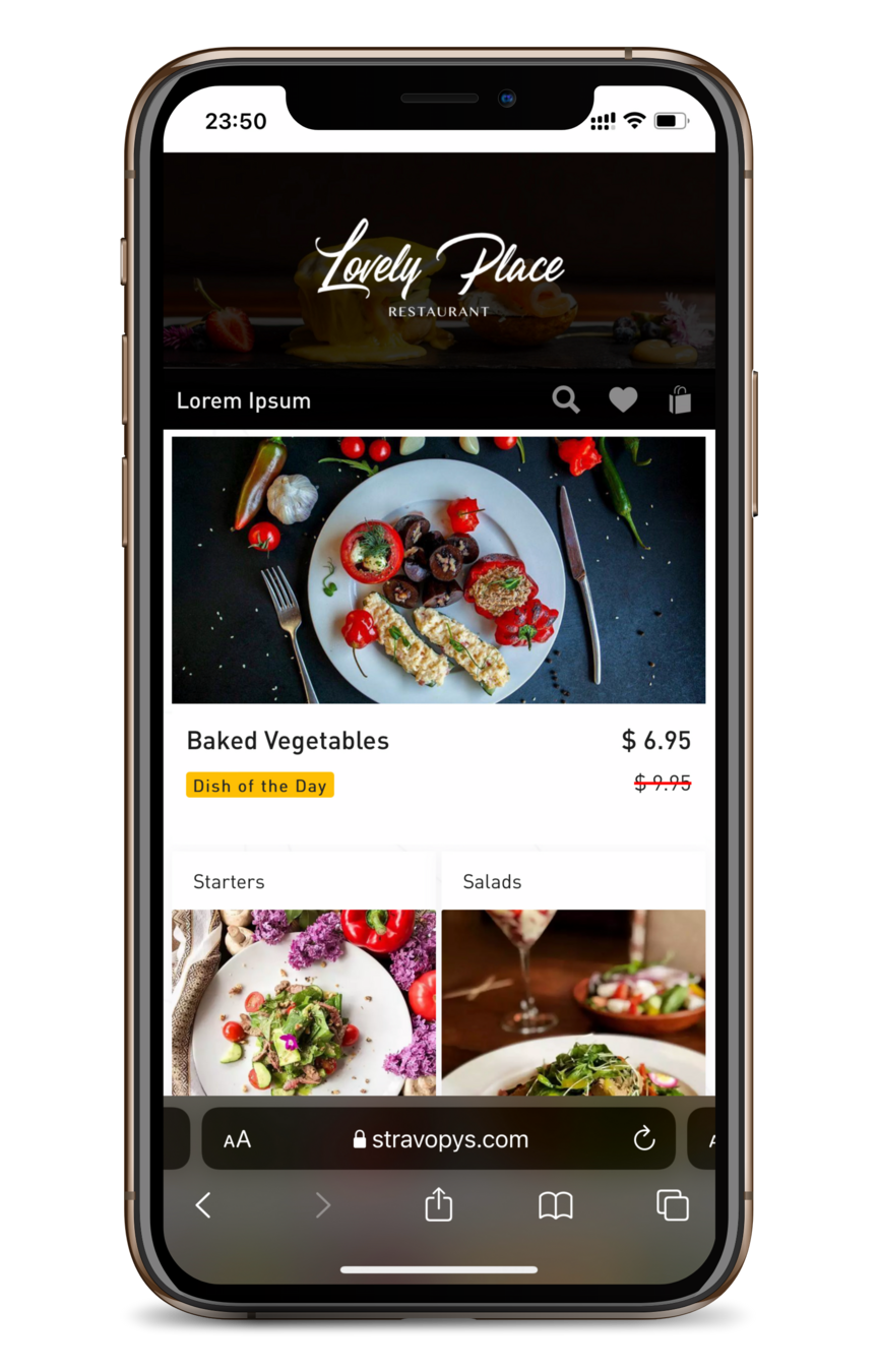
The era of creating websites for one type of device has ended with the advent of mobile phones to replace desktops and laptops. This influenced existing approaches, made me think about a new reality, and change my thinking. One of the key trends in web design is the Mobile First rule, proposed in 2010 by Eric Schmidt (Google CEO). The design of any site should initially be created for correct display on mobile devices, then on tablets, and only then on laptop screens and monitors of stationary computers. Ultimately, every element of a web page must be adapted to the size of any device.
Dimensions and Positioning
All elements in Stravopys follow the guidelines for responsive design. In the case of the header, the image is centered, and the height and width change depending on the device. If the ratio of width to height of the uploaded image differs from the ratio of width to height of the header, this may lead to incorrect display on some devices. To avoid unexpected results, it is recommended to use a 1080x440 pixel image. If the width of the image is larger, Stravopys will automatically optimize it while maintaining the aspect ratio.
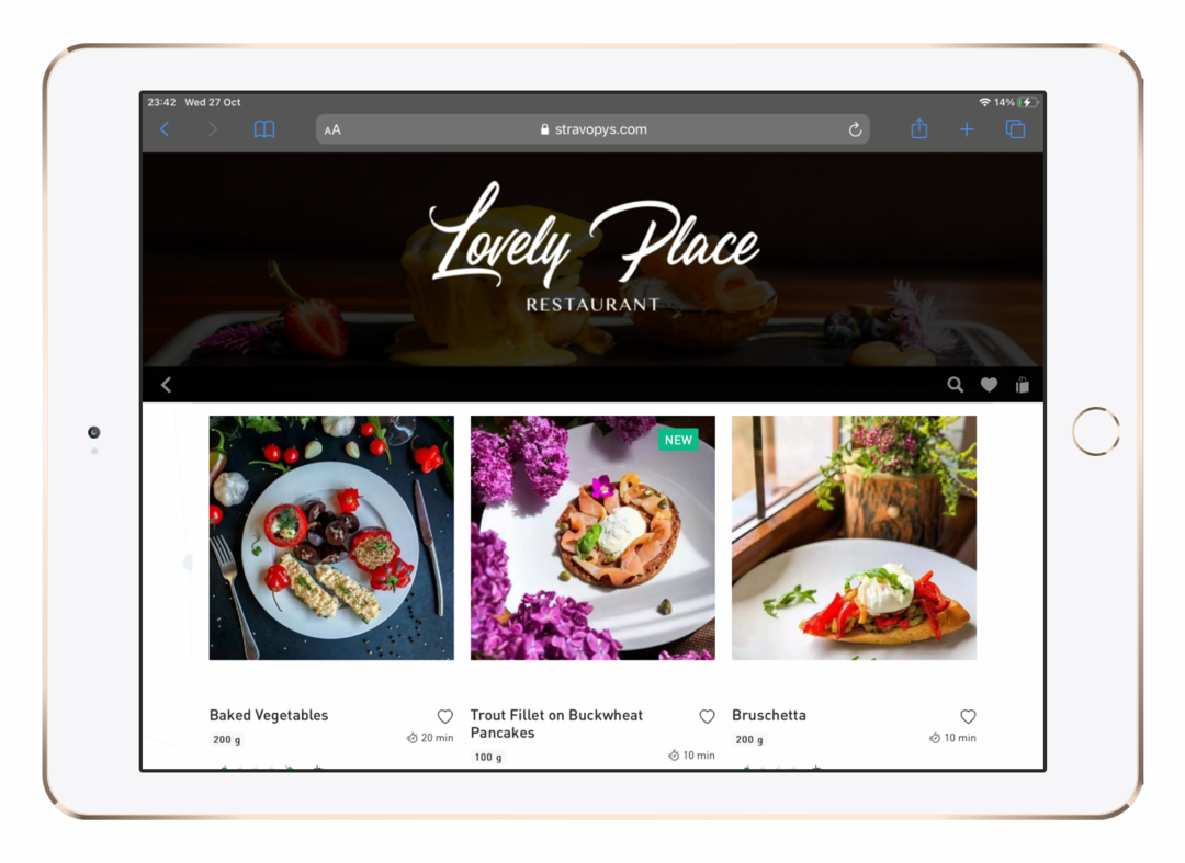
If the width of the image is less than 1080 pixels, it will lead to a loss of quality due to stretching on the screens of laptops and stationary computers.
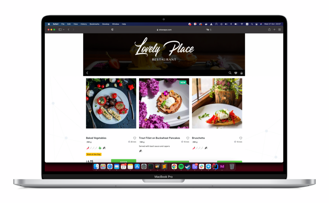
It is also worth considering the location of the text if it is part of the image. Be sure to check the correctness of its display after loading.
Header decoration
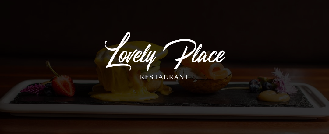
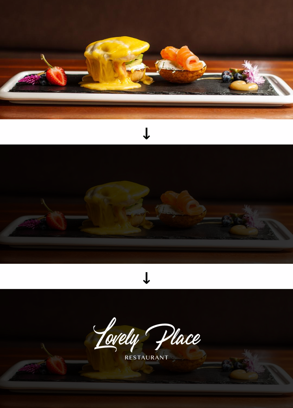
Creating a header is a creative process, limited only by a flight of imagination. The main thing is that it is in harmony with the rest of the menu items. As an example, consider creating a header for the "Lovely Place" test restaurant.
- Photo of 1080x400 pixels.
- Applied a dark layer with 90 percent opacity (this way the white font of the text does not blend in with the selected background).
- The text is centered horizontally and slightly above the center vertically.
- Don't forget that every detail matters to your customers. They may not notice it, but every little thing subconsciously influences, forming their general idea of the establishment. An electronic menu is about taking care of their health, a convenient electronic menu is about taking care of their time, and a convenient, beautiful electronic menu is about their pleasure.
